The customer
champion of
train travel
Leading the way for human centered design in train travel across their mobile apps.
Services
- Mobile Apps
- Service design
- User testing
- UX Design
- Product design
- UI Design
- Brand development
- Design system
The Challenge
Trainline is one of the biggest train ticket operators in the UK and needed a mobile offering that was built from the user up.
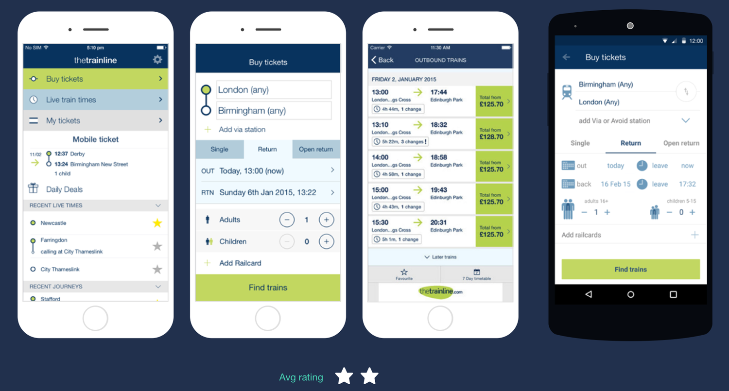
I joined the Trainline mobile team when they already had apps in both the iOS App Store and the Google Play Store, but lacked customer satisfaction with an average rating of 2 stars.
Bringing a design thinking background, a drive to shape a design culture from human-centred and experience of being hands-on with product design, the length of work was fast, intense and very exciting.
Putting peoples needs at the heart
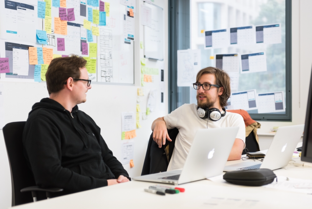
A huge part of what demonstrates the success of our outcome was the ambition to design to real-world user problems. Regular user testing was conducted every other week by myself to validate existing problems, test new ideas and also serve as a great way for us to keep our finger on the pulse of public perception.
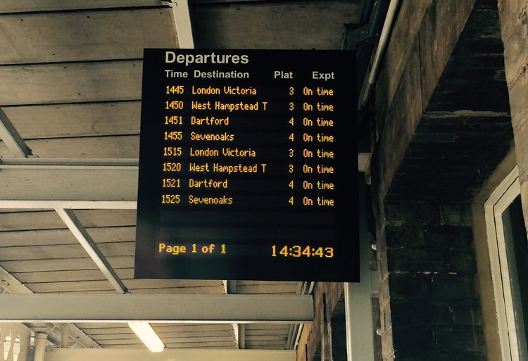
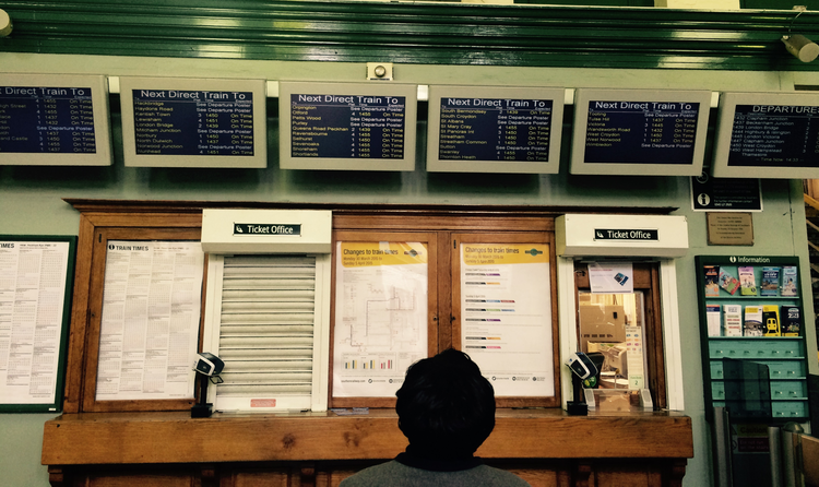
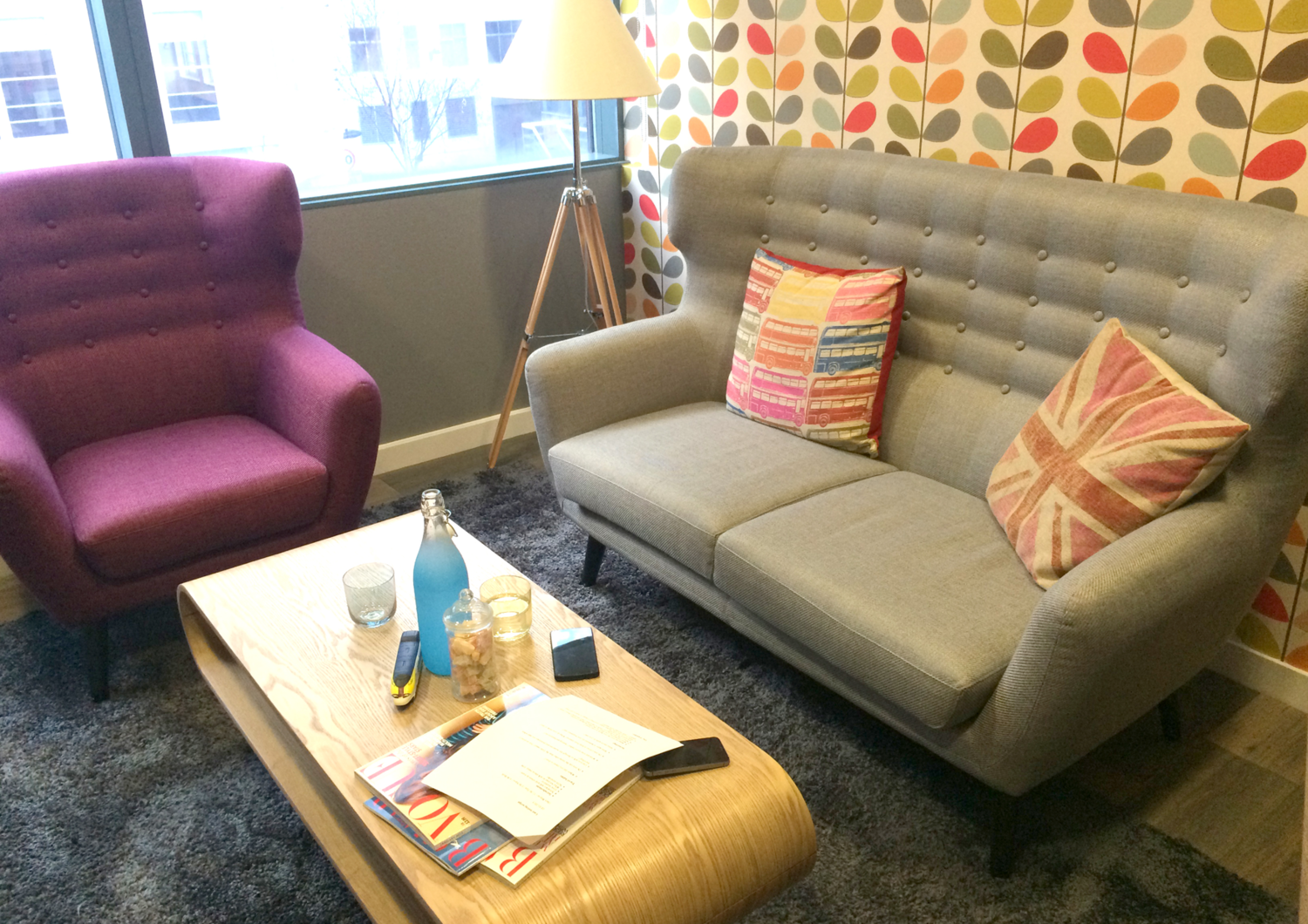
Listening to people's real-world train experiences
Regular 1-on-1 user discussions were conducted throughout the whole duration of my time there. This was a vital part to test new ideas, big or small, double check on current builds and just as crucially, open up the particpation to teams outside of design to more than just design.
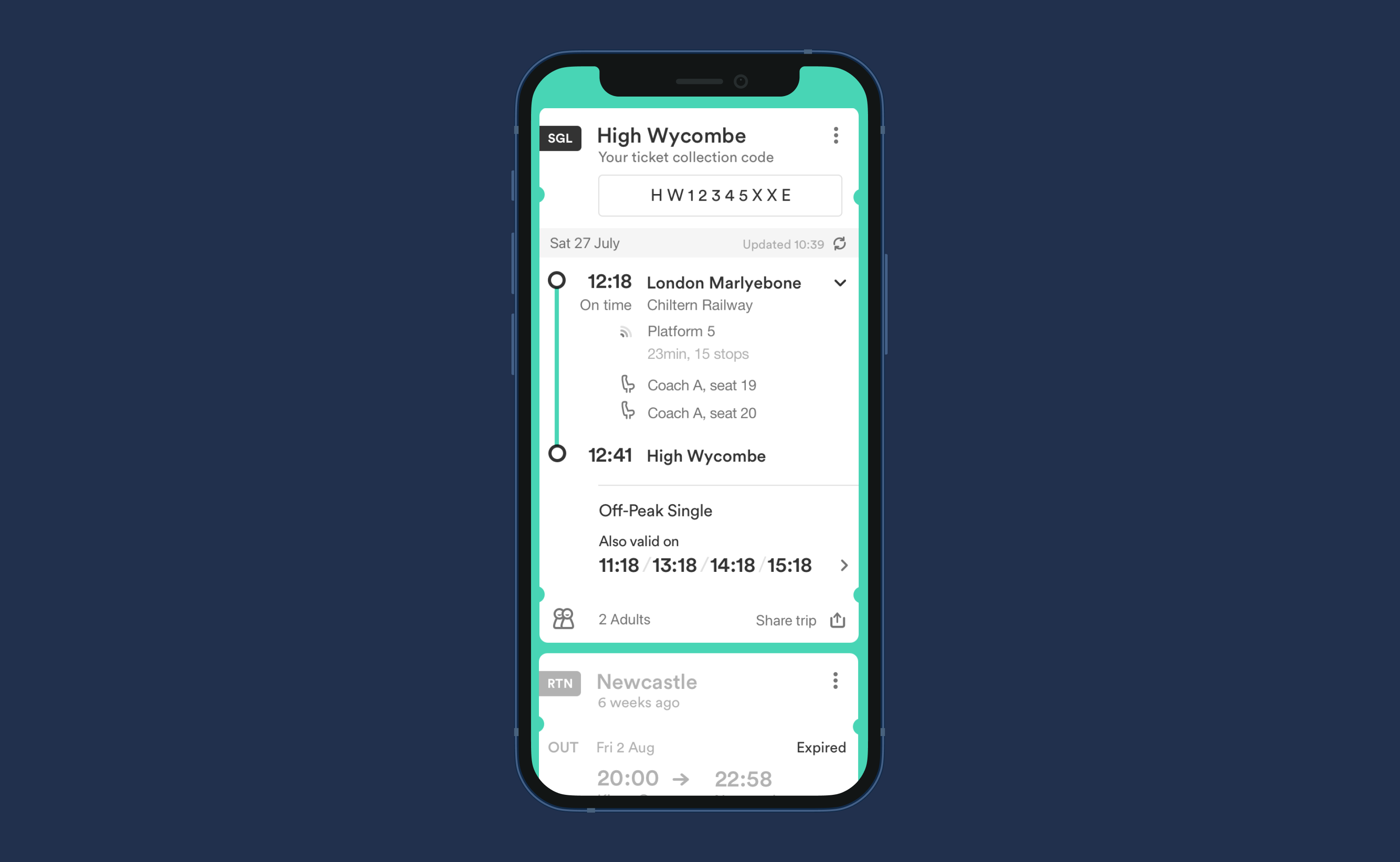
Also valid on...
A problem that we've heard time and time again, a customer buys a train ticket not realising it's valid on many other trains that day. A common problem that shaped a simple solution and got a great response in testing.
The problem wasn't something we were actively listening for, but it shaped a solution that could be close to our design methodology of the time and to be the customer champion.
A design to stand the test of time
People's time is valuable, especially in the context of a couple of seconds could mean making their train or not. The product was to be as simple as possible. Understanding reading rhythms and visual density and many product design tips like progressive disclosure.
We would strive to test in as real scenarios as possible, this meant anything from the existing app to see what parts caused any friction to prototypes for new concepts to working code prototypes.
Design system foundations
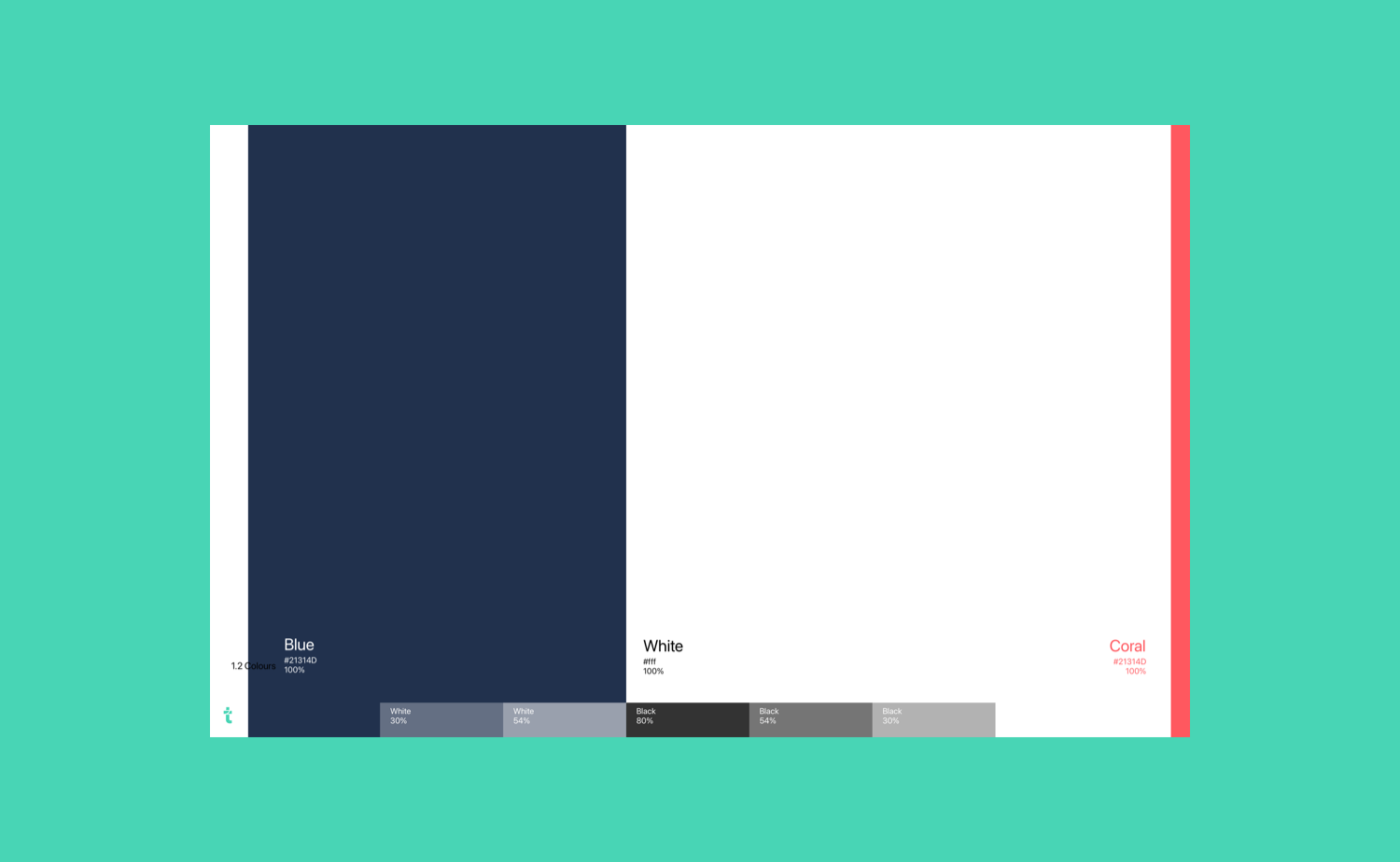
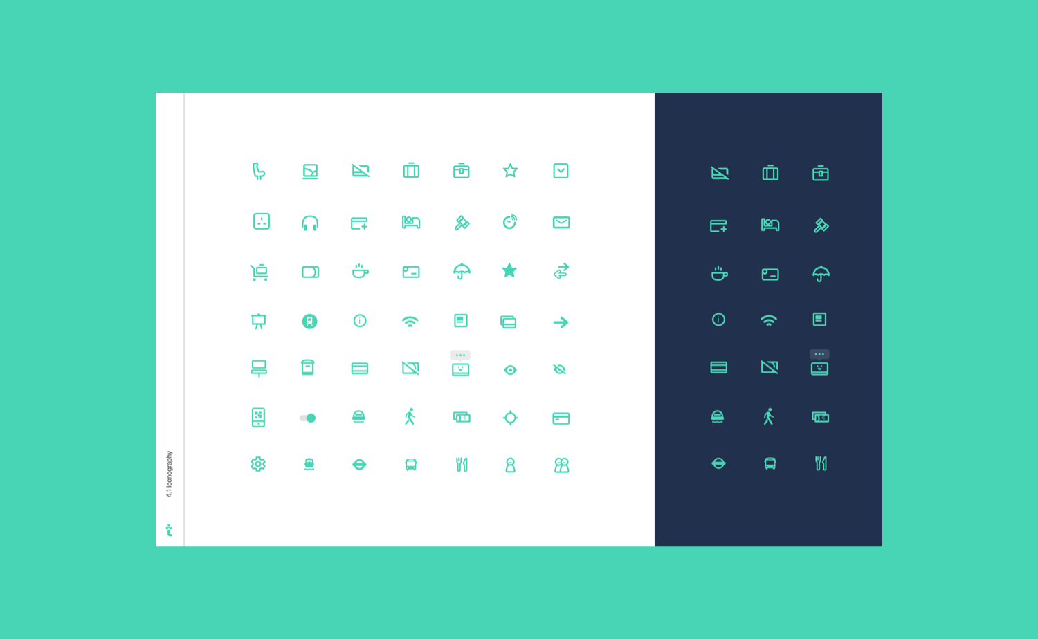
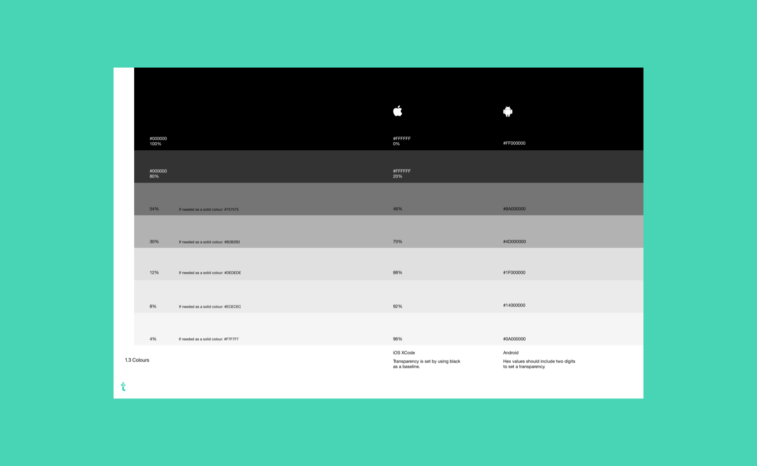
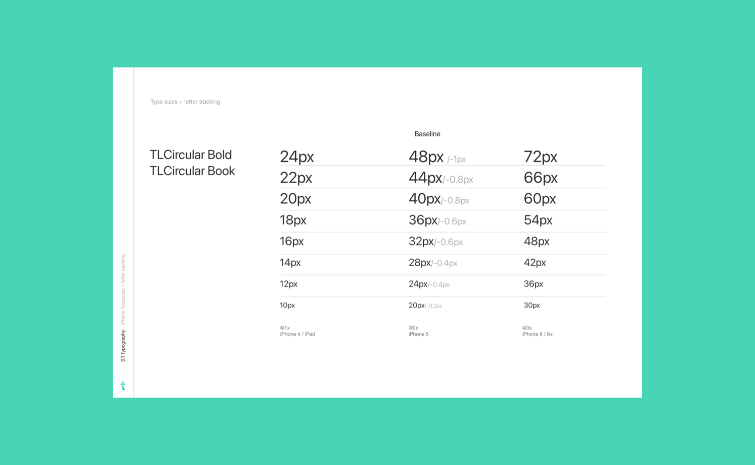
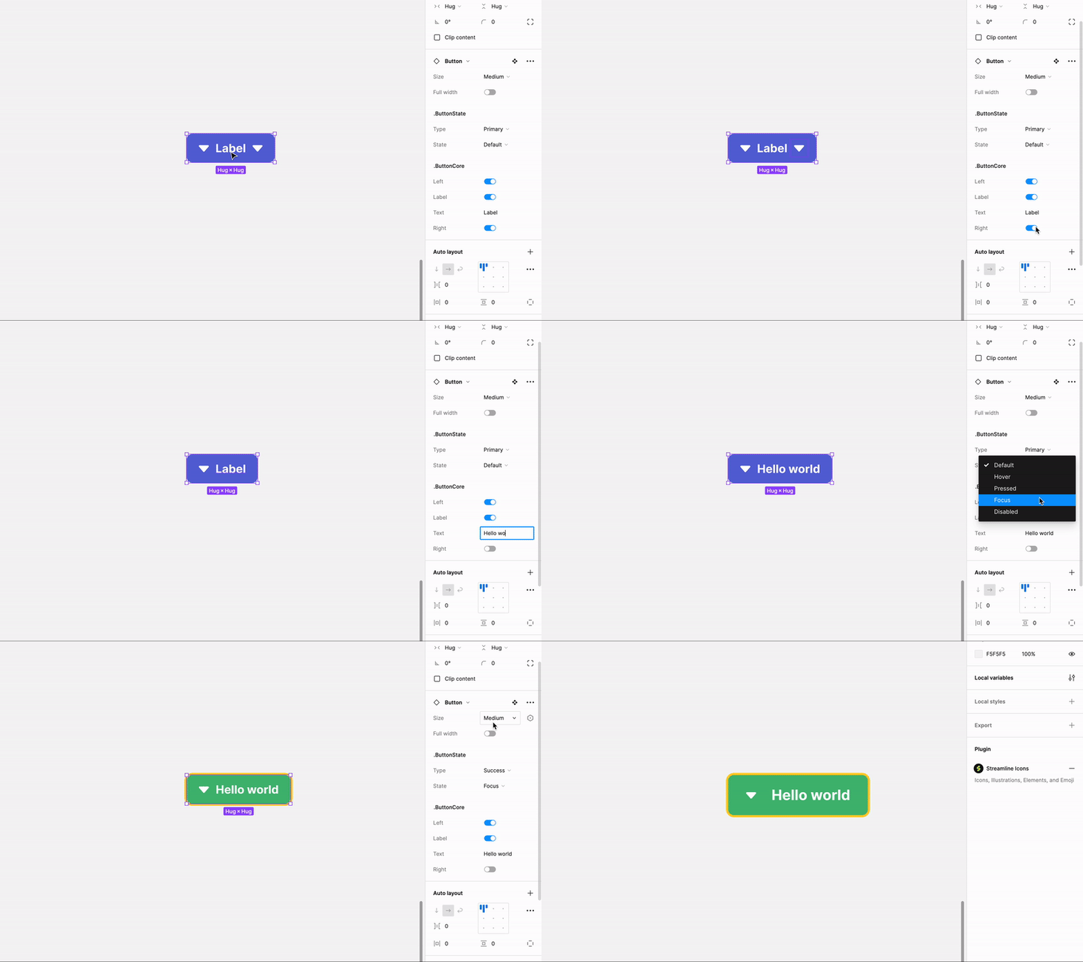
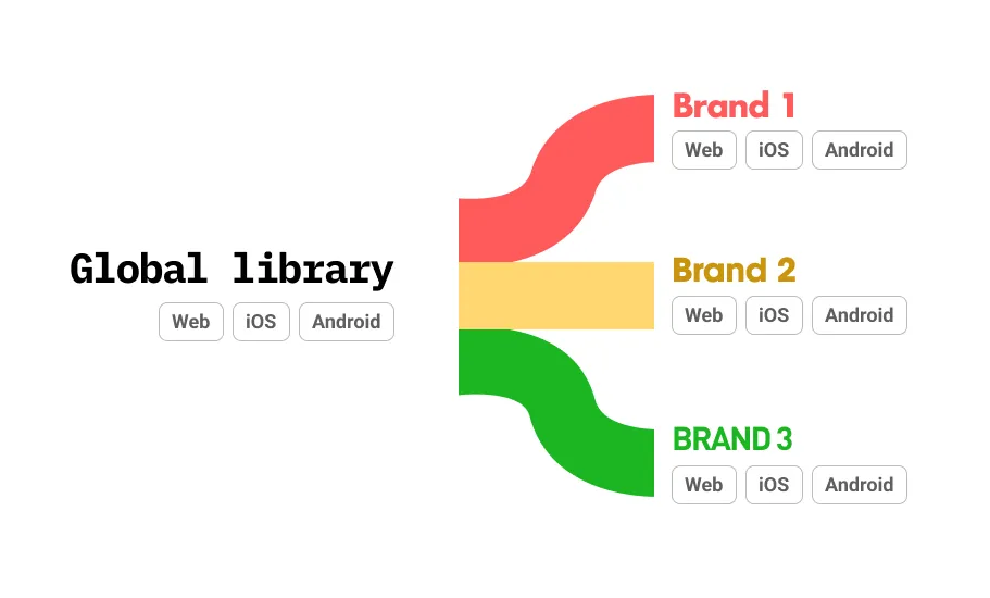
Working at speed and wanting to maintain a consistent high level of design meant we needed a design system to grow with us. I worked closely with designers to set these high standards and lay out a common shared component library that means designs can bring consistency, a high level of quality and have a product that feels tailored from end-to-end.


Conclusion
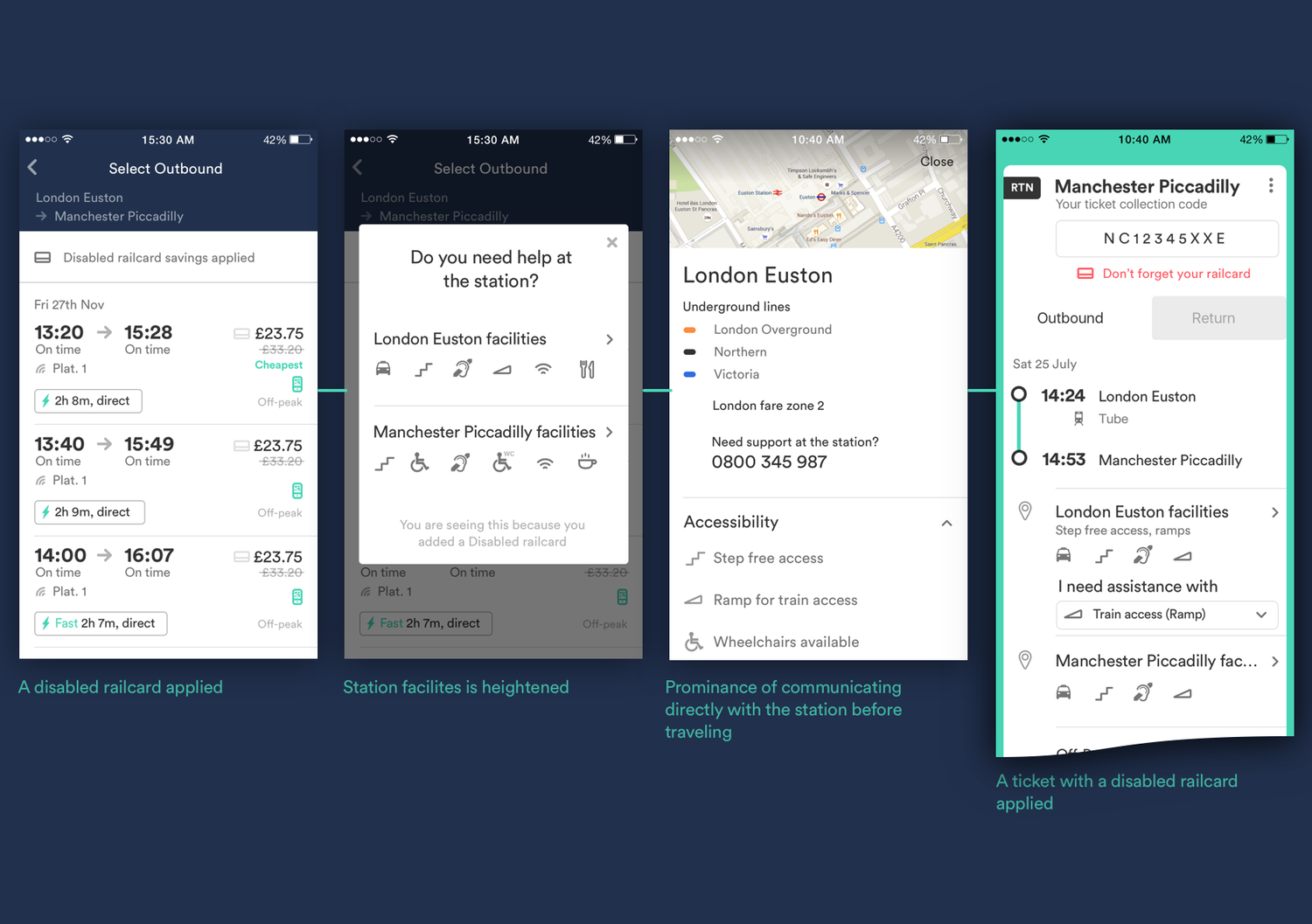
The Trainline project was hugely transformational, both in terms of producing customer loved apps, evident with regular 5-star reviews, but also outperforming our ongoing business metrics. Having a lot of design autonomy in this project I'm very proud of a design solution that is standing the test of time.
Design credit- Liam Hughes – UX Designer
Honors &
Mentions
| The best transport apps to help you find your way through the snow | The Guardian | |||
|---|---|---|---|---|
| Top 10 transport apps for smarter travel | The Guardian | |||
| The Best Transport Apps | Gizmodo | |||
| Apple Watch best of 2015 | Apple | |||
| 9 best things of the Trainline app | econsultancy | |||
| Best of September 2015 iPad Apps | Apple | |||
| Regularly appearing in Best new Apps | Apple App Store | |||
| Number 1 app of Top Apps for Transport on Android Play Store | Google Play Store | |||
