Multi-brand,
multi-platform
Design System
Sainsbury's are one of the leading supermarkets in the UK. They've built up a number of different products specifically in grocery shopping but also span to others like finance with Sainsbury's Bank. Along building their own products they have expanded with brand affiliates like Nectar, Tu clothing, Habitat and most notably Argos. Each bringing their own brand values and resources, we saw this was a time to pause, take stock and address the wear and tear of product delivery over the years.
Services
- Design System
- Multi-brand
- Multi-platform
- Headless Global UI library
- Design Tokens
- Contribution method
- Design leadership
- UX Strategy
- UX Design
- UI Design
The Challenge
How can Design Systems enable product teams to work more efficiently and produce an experience that feel more aligned.
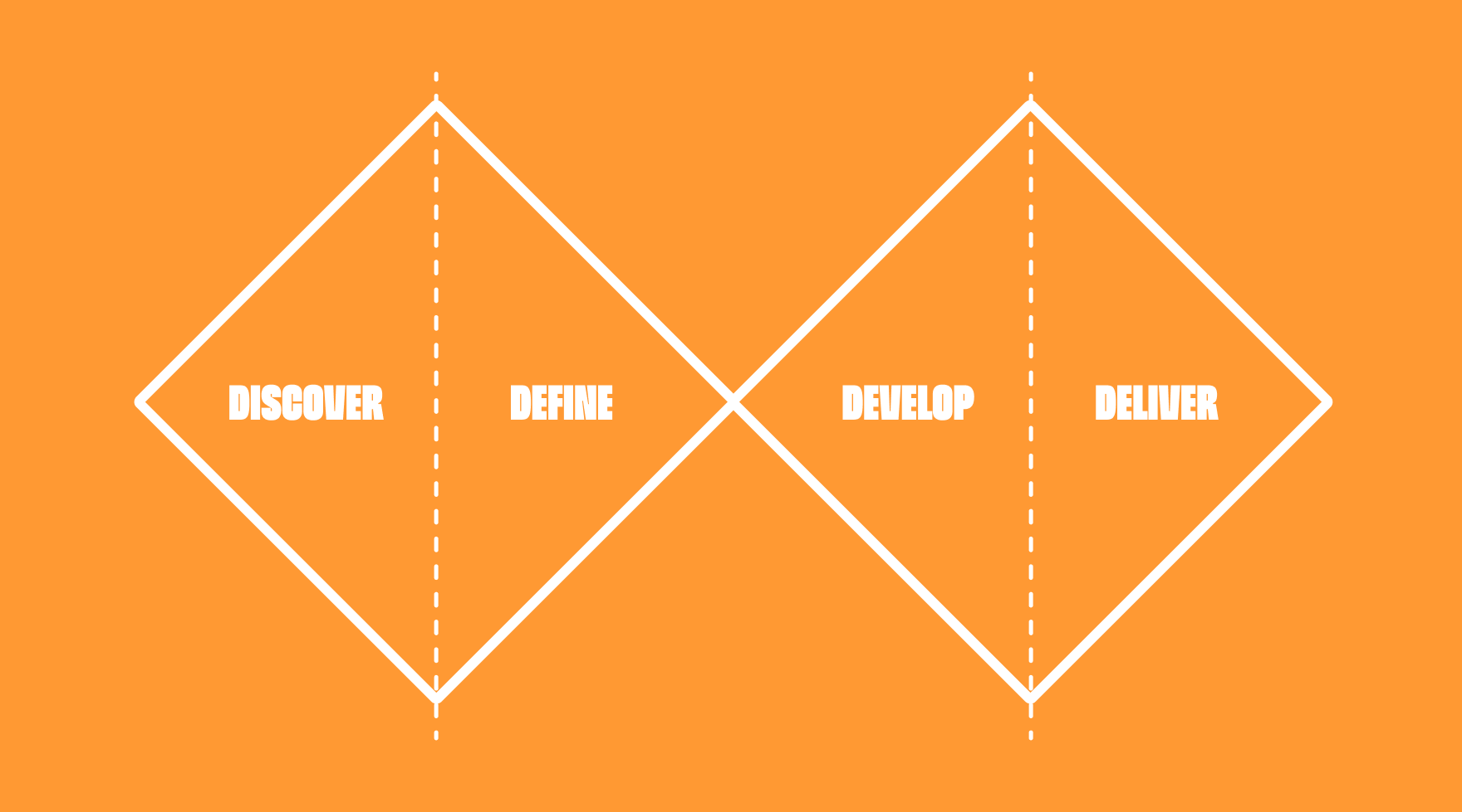

Discover
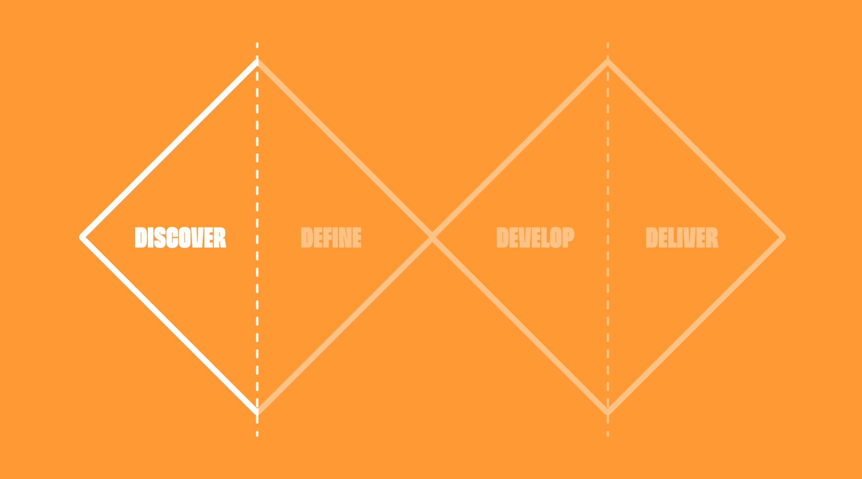
A project with such a huge scope has to start somewhere. The discovery was lead by talking with other designers, understand how they're working, what conditions are they up against, their existing knowledge of design systems, their skill level with tools like Figma and be open to hearing as much feedback as possible.
It's understandable for products to eventually feel the wear and tear of working in fast agile environments, features are shipped and delivery deadlines met but sometimes some corners need to be cut, this was starting to show in end-to-end experiences and a difficulty to supporting a unsustainable siloed working environment.
Designers have been great at making their own efficiences with local Figma libraries, discussion and audits over these highlighted the level of duplication and inconsistencies by a lack of transparancy and centralised governance.
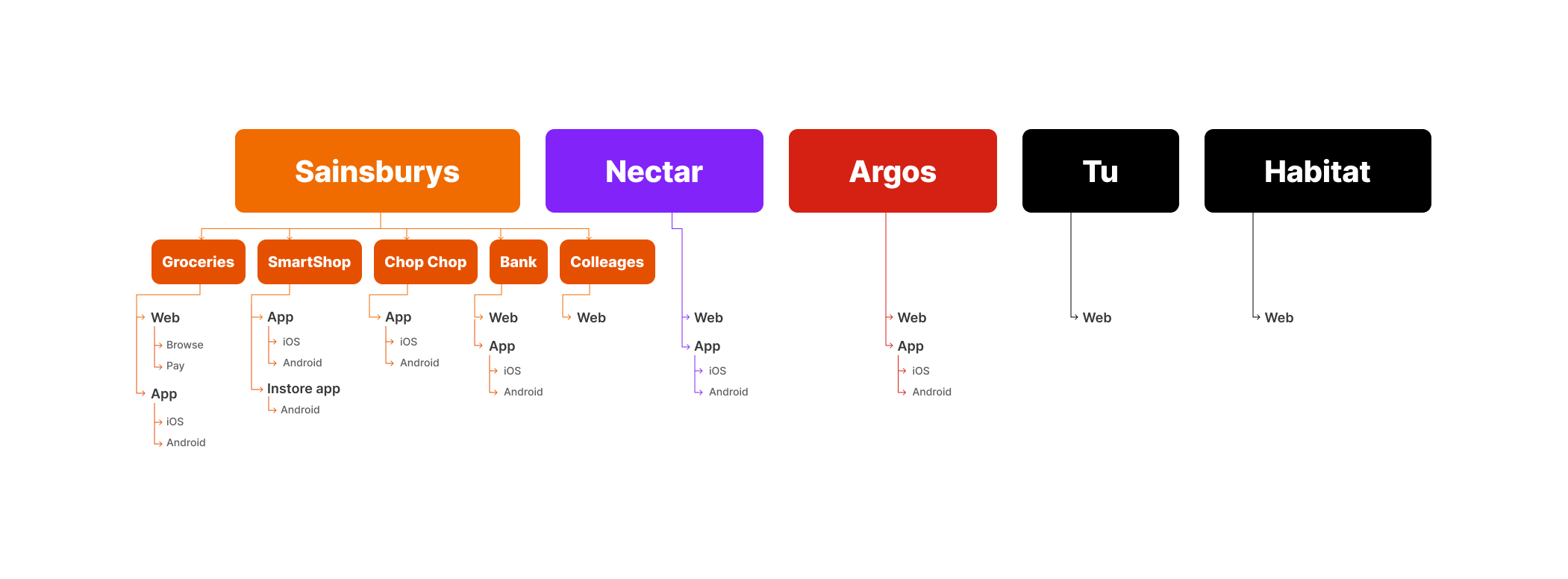
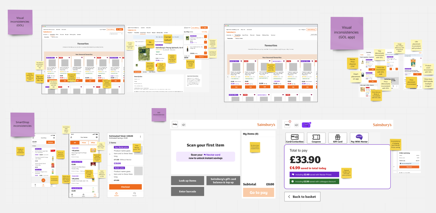
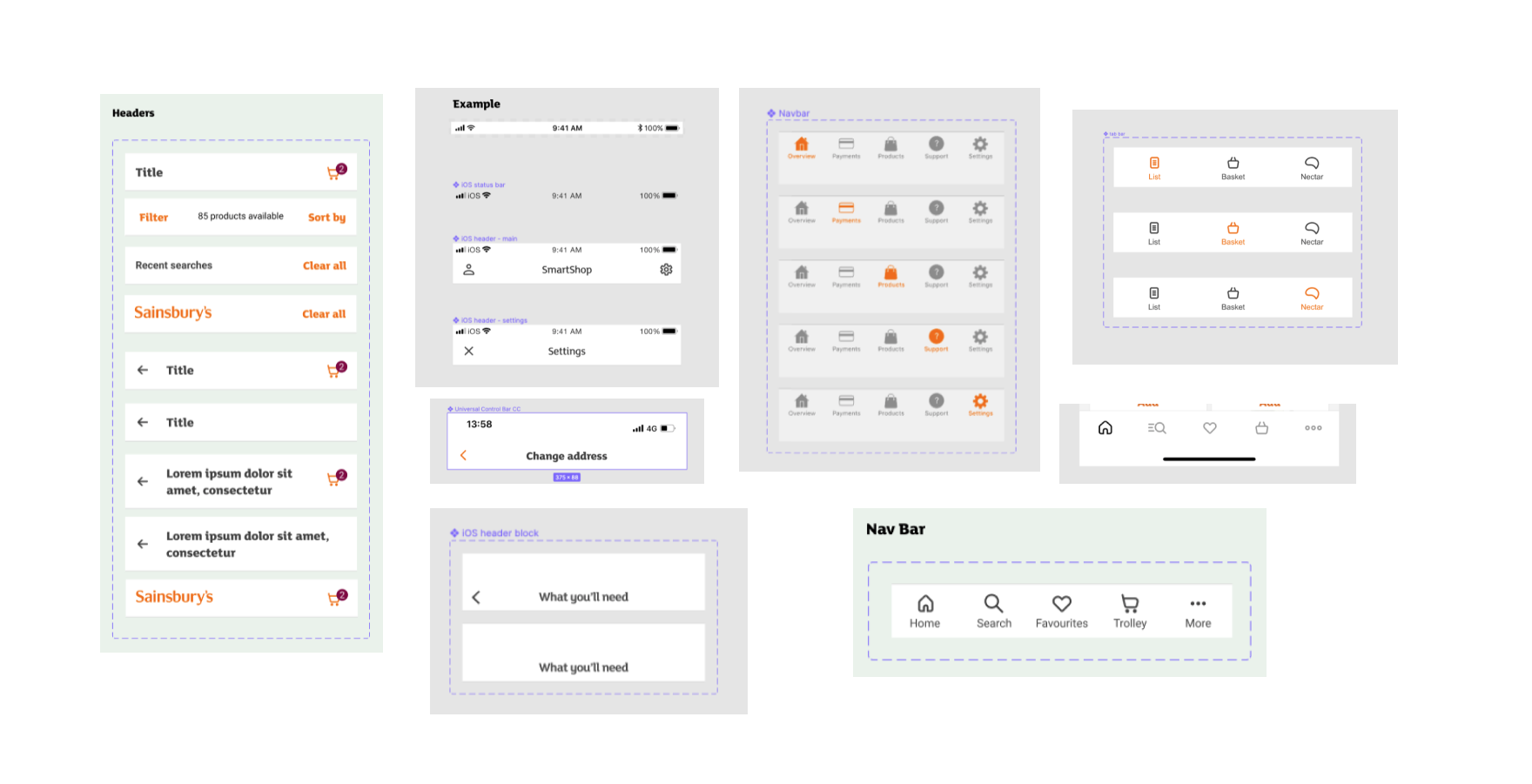
Different company cultures
An interesting discovery that come from the different design systems and libraries in place is how it has influenced or been influenced by the working cultures.
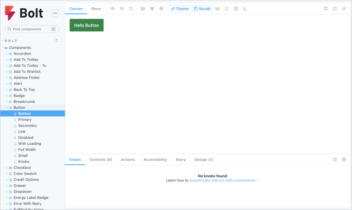
Argos Bolt Storybook library
Used on Argos brands (Habitat & Tu) it's a dev first component library, its widely adopted and maintined through development. There is no Figma library counterpart, limited to web only components and being dev first means designers playing catchup or starting from scratch each time.
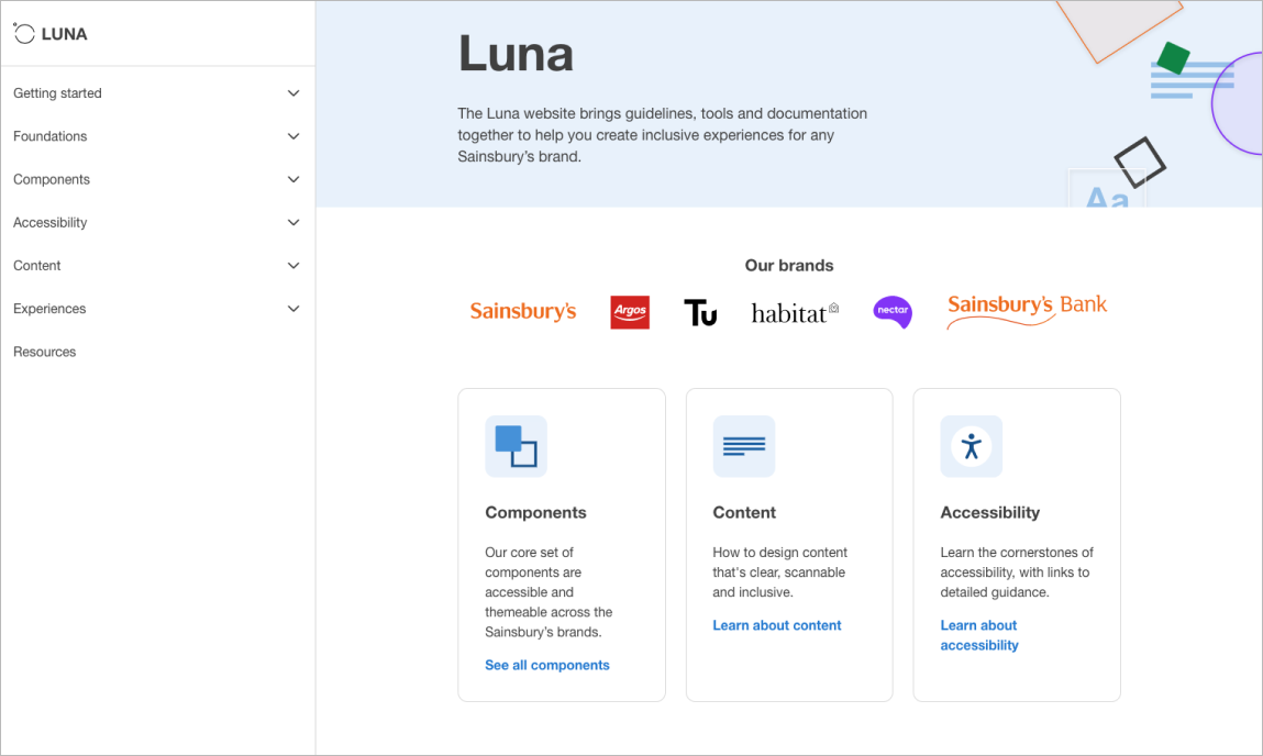
Sainsbury's Luna
Used across the Sainsbury’s brand and a growing alignment with a Figma UI library. Luna recognises the broadness of a design system with patterns and guidelines and heavly influenced by accessibility. There has been a small adoption in design and limited adoption in development
Define
What is a design system?
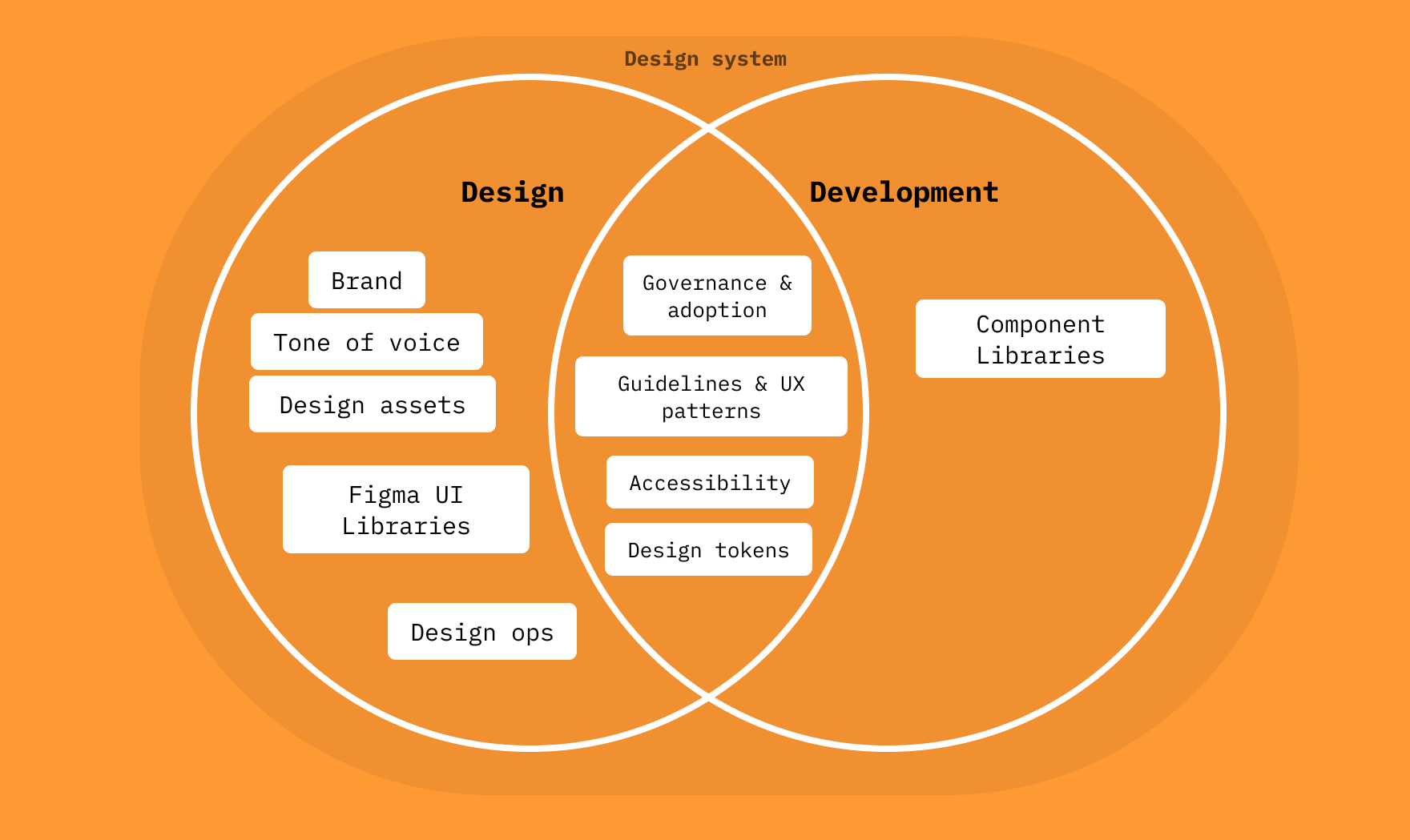
A common misconception is that a design system is just a UI library. UI libraries are often built out of a team or individuals personal desires to stream line their own workloads but this only goes so far to fix the issue and it soon falls apart when updates or maintenance are needed across multiple teams.
Sainsbury's had already recognised the value of design systems and as such, treated it as a product team. This would allow the team to follow the same ceremonies as a product and have their own goals and targets.
Design systems are not just for designers and theres huge overlap
Bolt vs Luna
Sainsbury's have made good lead way with both products but each has their faults. For us to move forwards we wanted to build on what would be most scalable and desirable. Bolt is more established in the development community but used inconsistently and lacks guidance and design input. Luna is design lead, offers stronger guidance a huge drive of raising standards of accessibilty but less mature in its usage.
A desired approach was to build a single source of truth that each discipline can benefit from, bringing parity between design and development and reduce workload duplication.
Develop
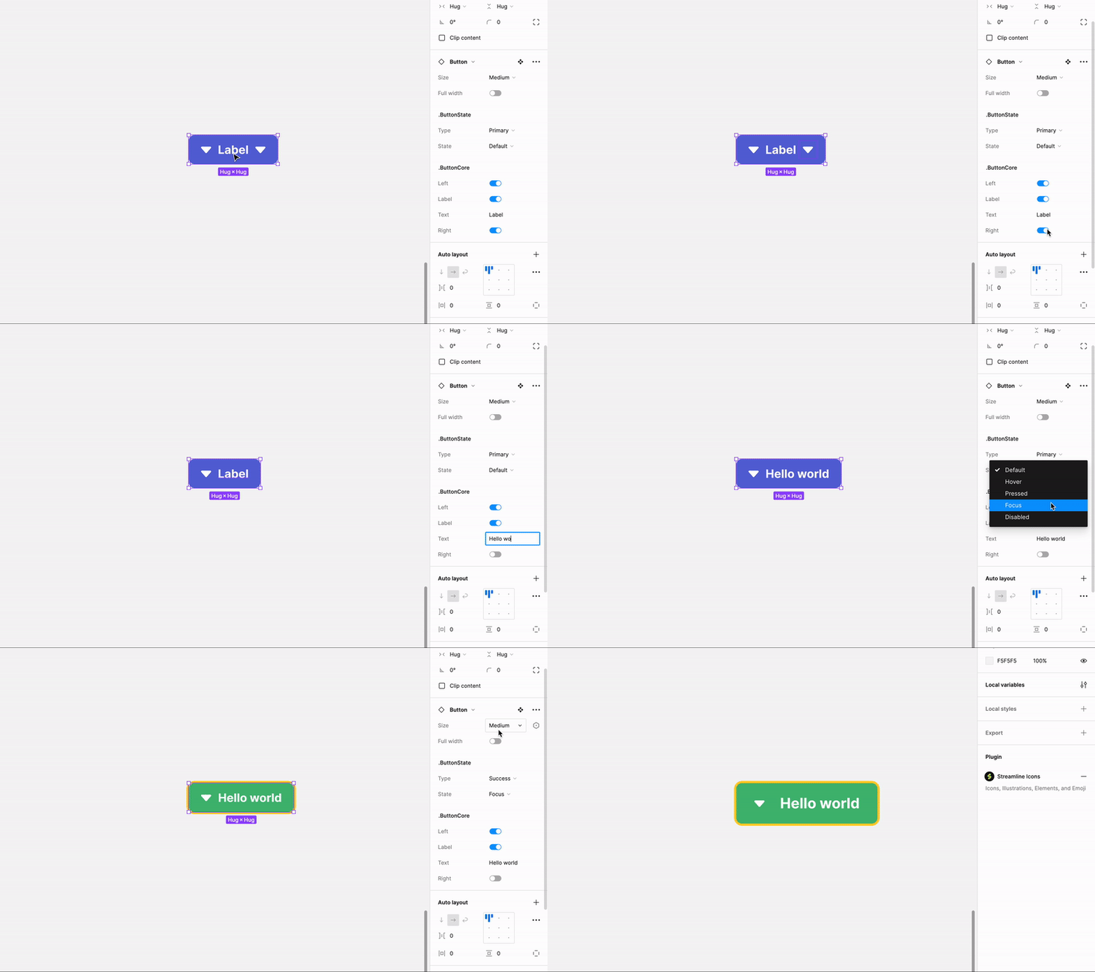
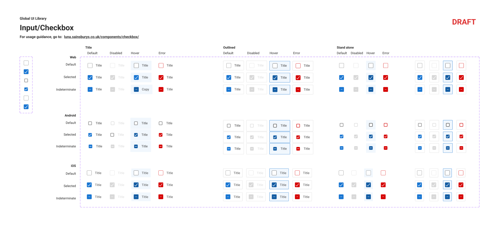
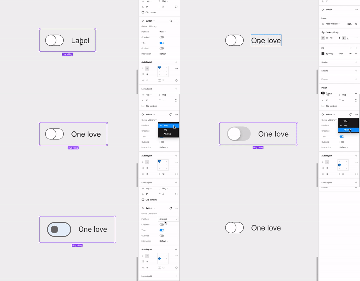
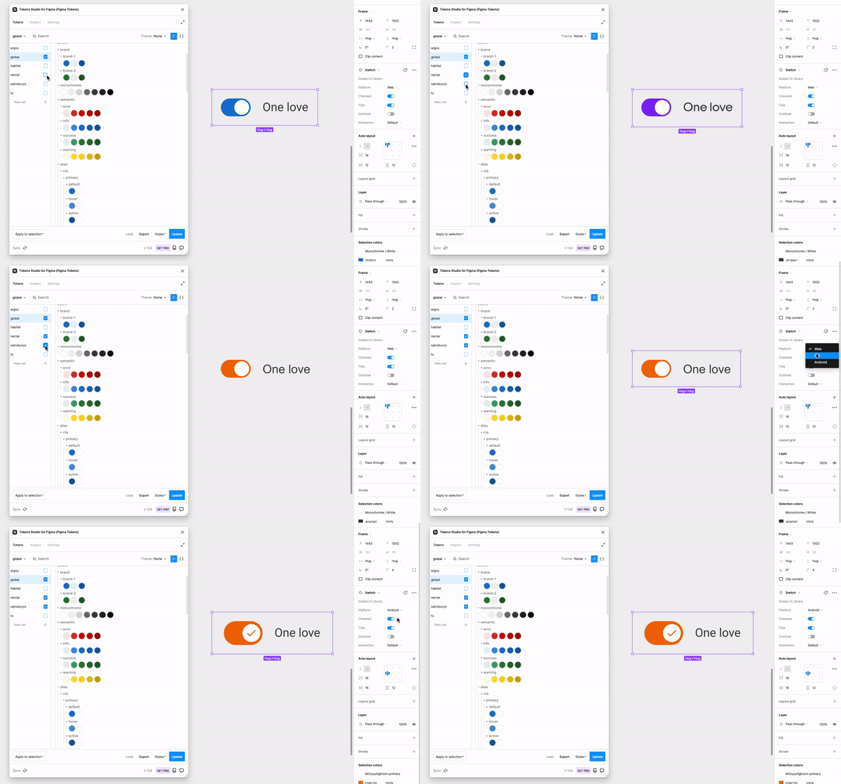
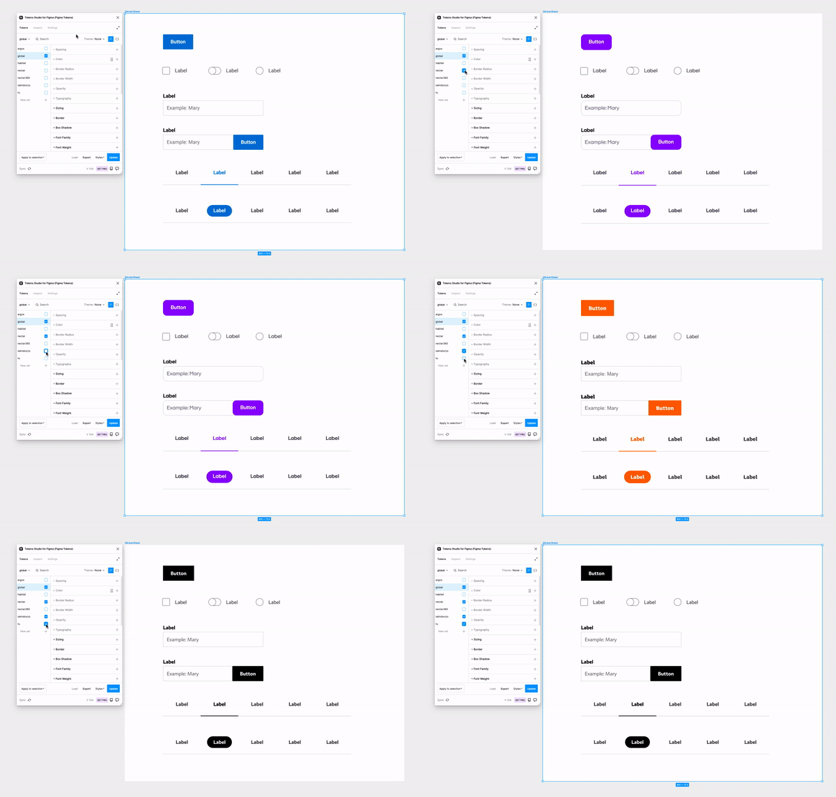
Figma UI libraies using live code
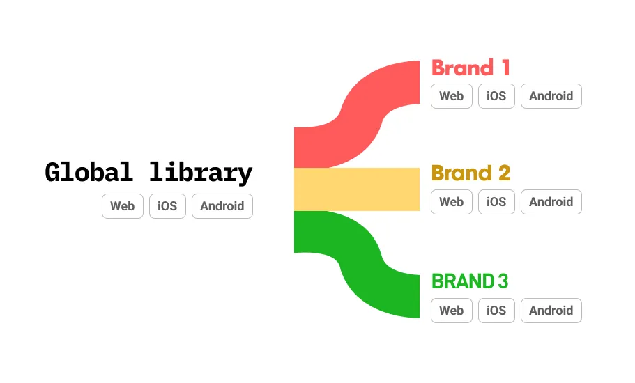
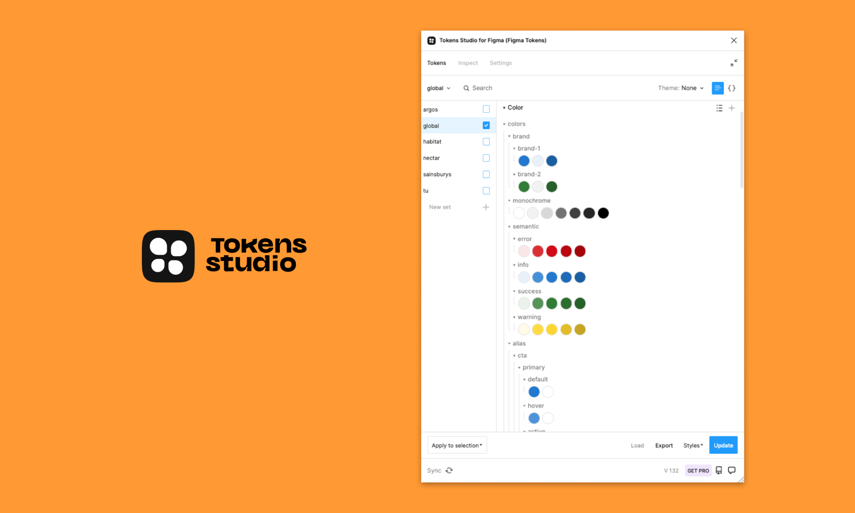
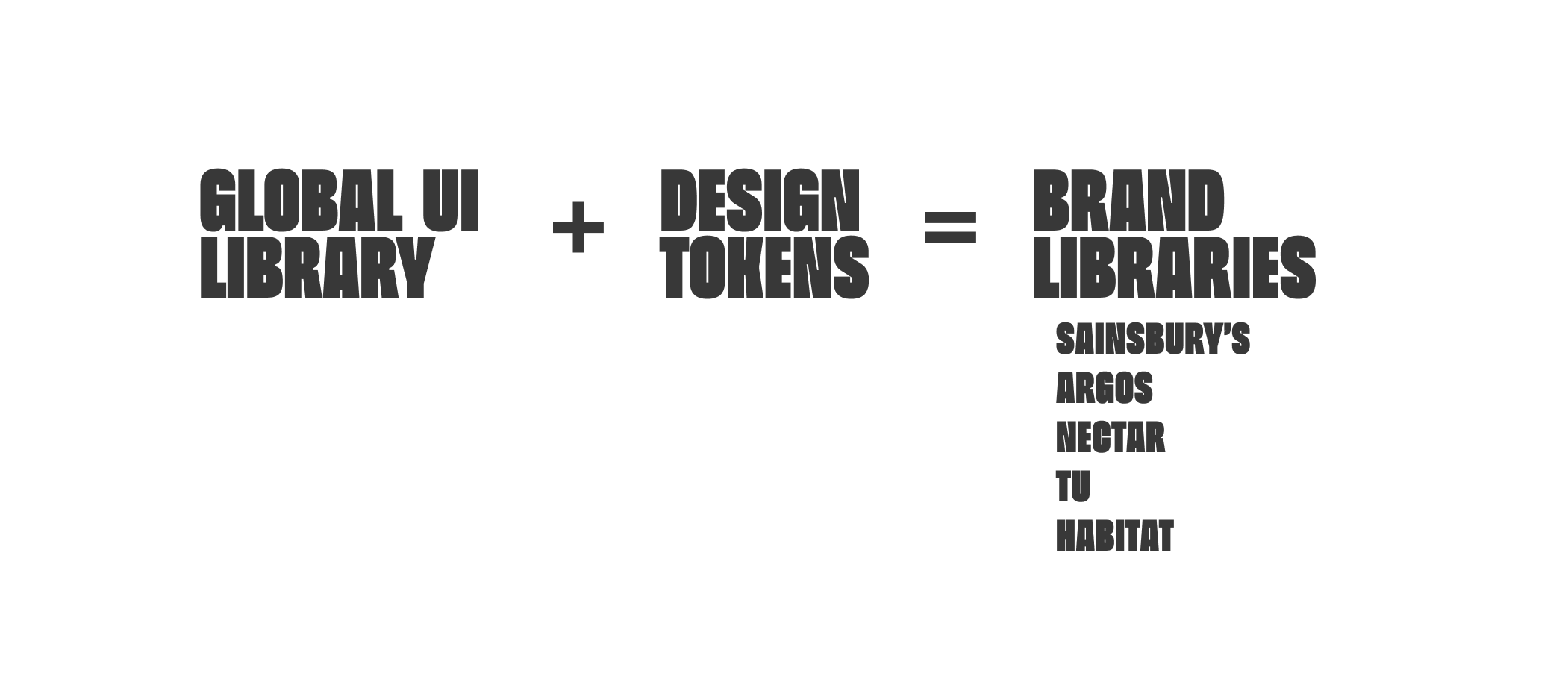
Working with Token Studio we were able to align and import design tokens from Development to be used on a headless Global UI library and exported to each brand. This offers flexibility with variables per brand and easily maintained by a small product team.
Building Global UI
Deliver
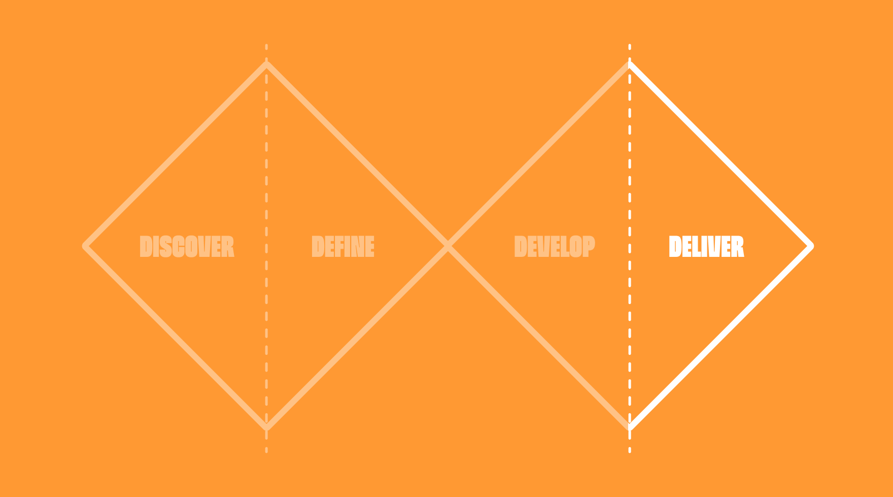
Design systems have advanced and matured massivly over the past few years. This has seen products like Figma and third party products rise to support these growing needs that Sainsbury's have been willing to embrace and innovate with.
Impact
Working closely with product teams through the development of the Design Systems has enabled us to work in the open and up skill designers along the way. We had a very conscious effort throughout to not become the bottleneck and the design system is here to support and encourage their productivity.
Like all good products, we can recognise our and build on our faults. Using Figma analytics offers us a small insight into weekly adoption and also where we can offer clarity or governance with component detachments. It's been great to see the growth of this system and raise the integrity of design, accessibilty and consistency of E2E solutions.
AVG Weekly inserts

Conclusion
It's been great to work with the Sainsbury's team on their design system. They've recognised the value a design system can bring to their product teams and assigned resources to it like any other product. I've seen many brands build their UI libraries and design systems by a passionate few as an extracurricular activity whilst juggling other product work, this rarely works, its not sustainable and becomes a bottleneck.
Sainsbury's deserve huge praise for the standards of accessibility they work to and its been great to see it at the forefront of all decissions.

