Medical tracker app for patients on blood thinners
Personal project for empowering patients taking warfarin. OATBook is aimed at patients taking Warfarin and having to take regular blood tests. This monitors the INR (International Normalised Ratio) against the patients range. Falling out of this range carries some scary consequences so it’s important to be monitored regularly.
Services
- Side project
- UX discovery
- User testing
- UX Design
- Creative design
- UI Design
- Brand development
- Prototyping
- Marketing
The Challenge
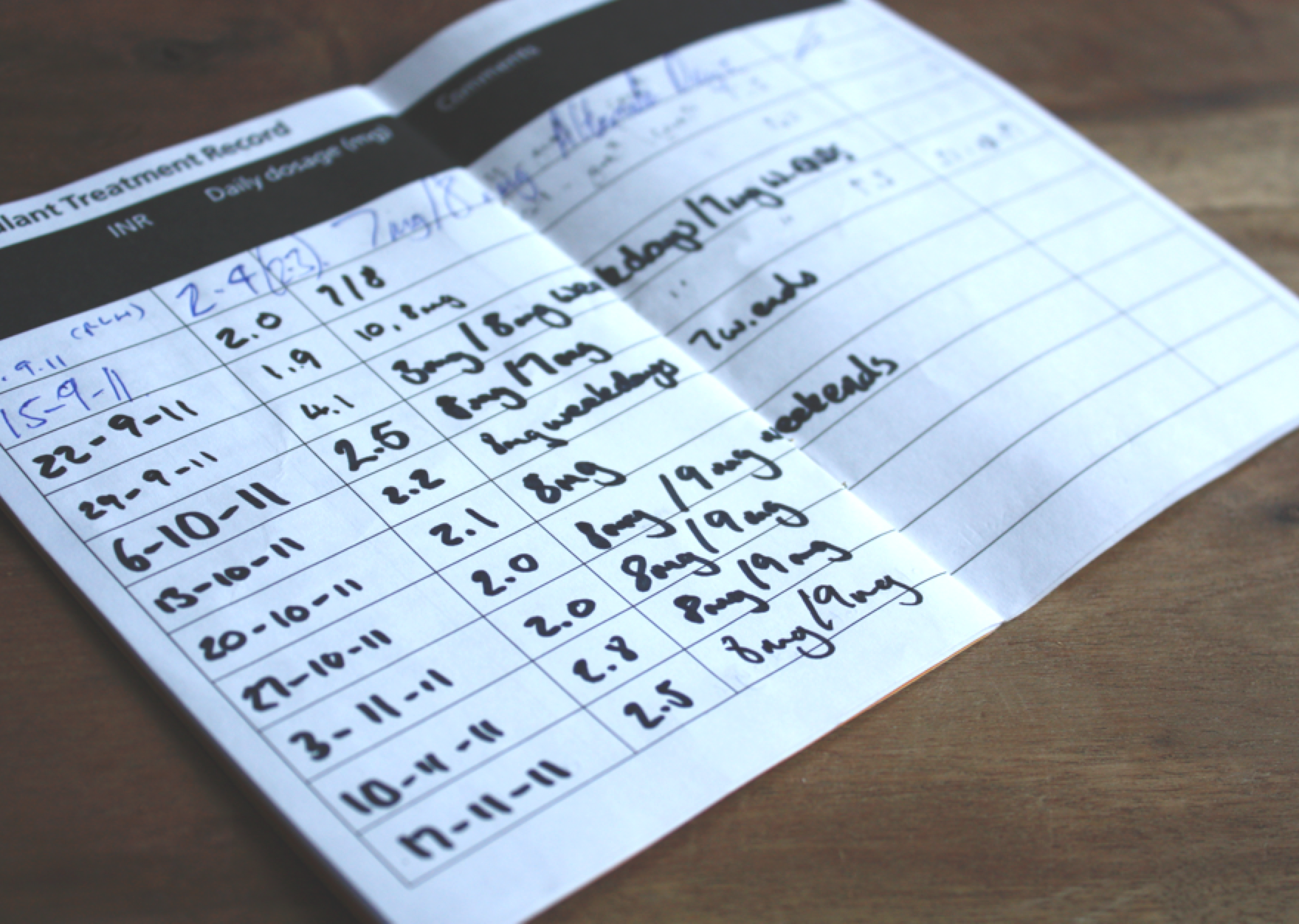
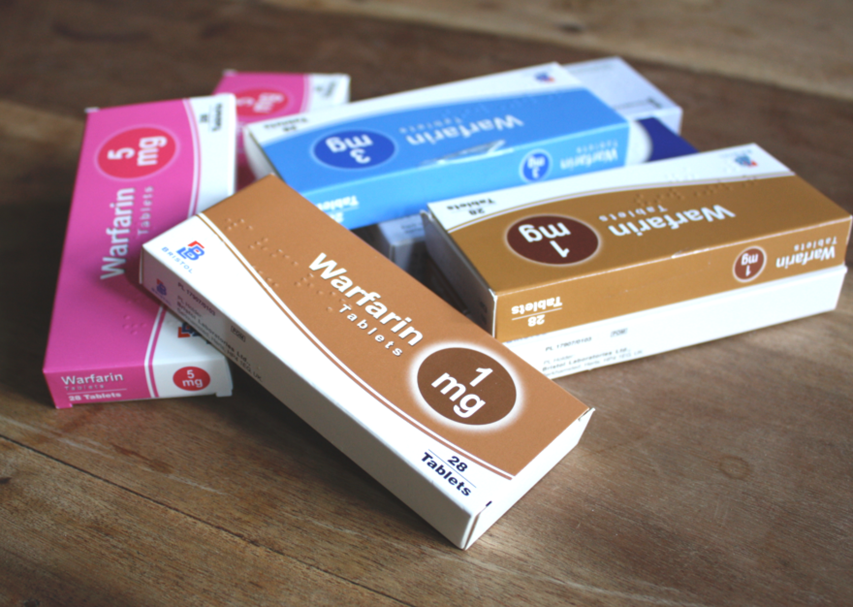
Patients undergoing OAT are either tested by their local anticoagulation clinic, or self test at home with a special blood tester. In both cases, patients currently have to record their INR range in a special yellow book issued by the clinic.
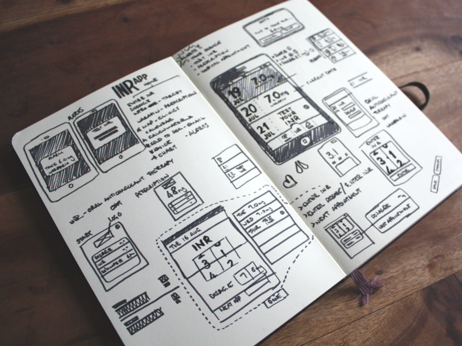
Sketch Development
Rather than having to manually keep track of my daily dosage in my yellow book, I wanted to be able to do it digitally. I wanted an app to record my blood test results, my appointment notes, prescription notes and the dates that I need to check in with the clinic. An app that helped me stay in my INR range by reminding me to take my medicine and monitor my blood regularly.
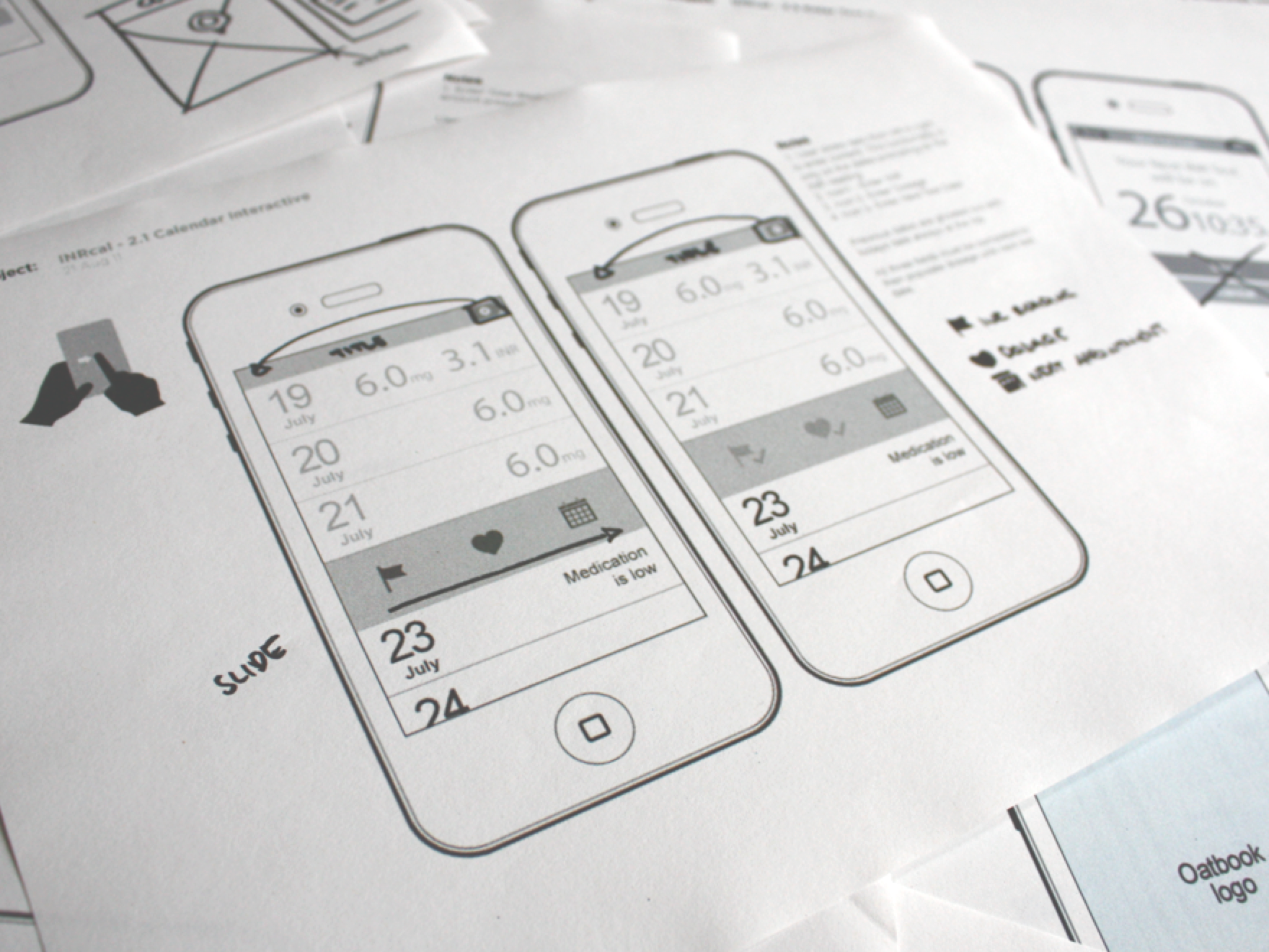
Creating the brand
Moodboards where created to influence the brand and shape the UI. From research a lot of the competitor apps where aimed at medical professionals and often put-off a patient user. The brand was to feel welcoming, friendly, routine and lightweight.

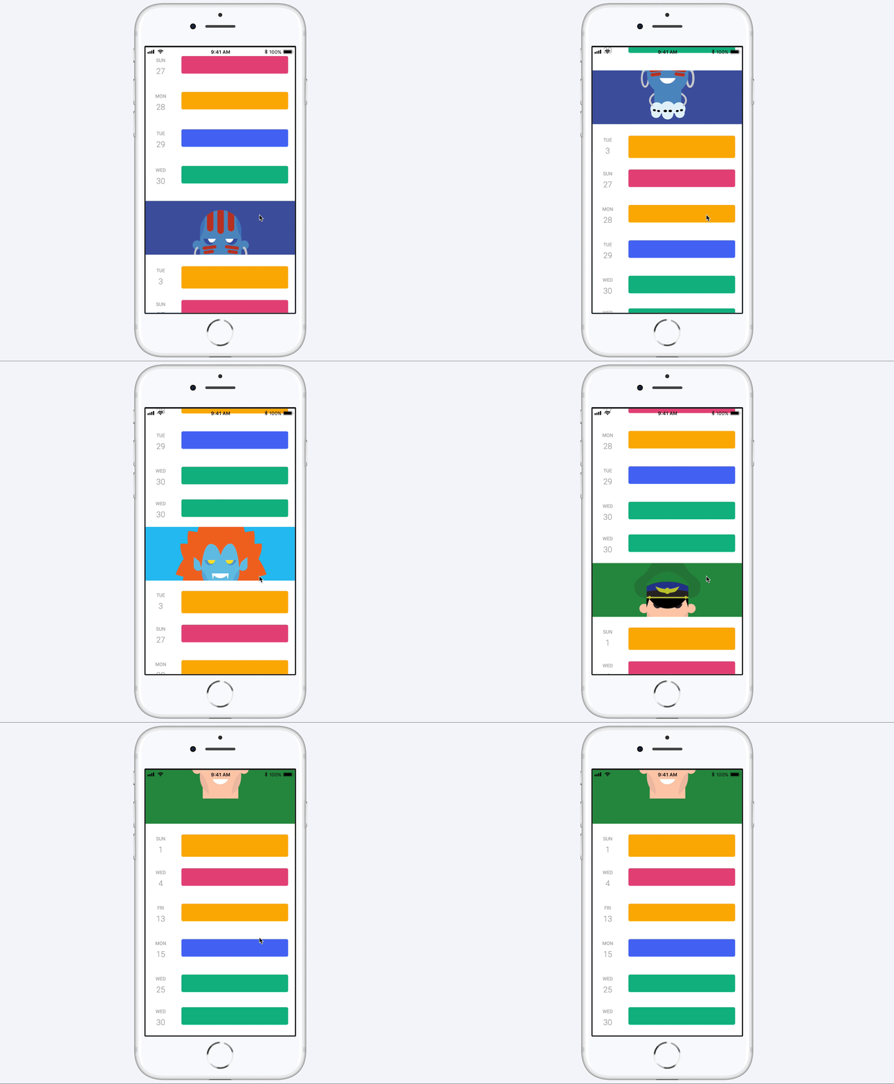
Your medical diary
One of the problems with taking sensitive medication like Warfarin and self-testing is theres a lot to note and often doens't follow any regular pattern. The diary along with the rest of the UI was kept minimal allowing to focus on one thing at a time.
Medical history in one place
A big feature that came out from user testing was the ability for the user to see a history of there dosages and blood readings. This was often kept for medical professionals but displaying to the patient was a great way for them to feel in-control.
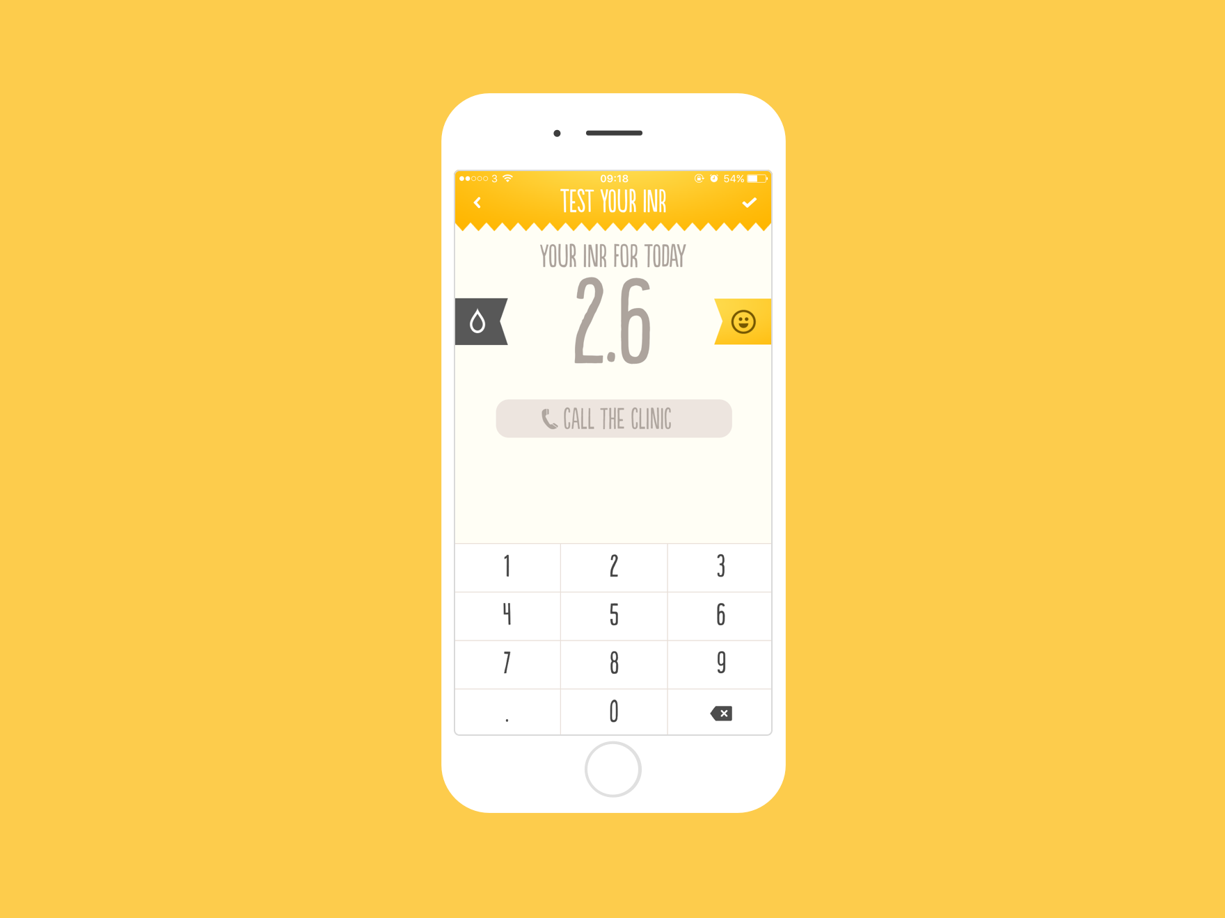
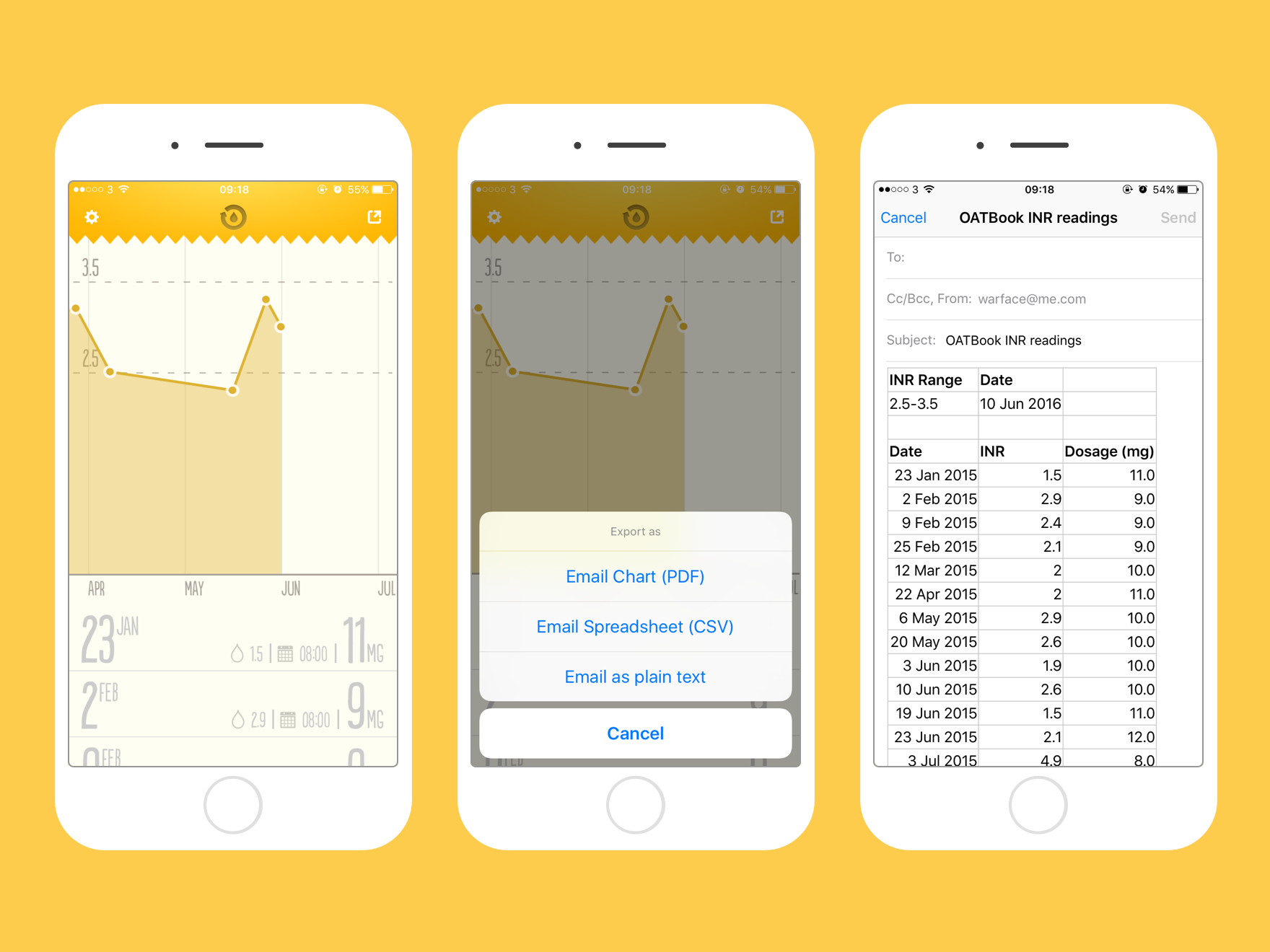
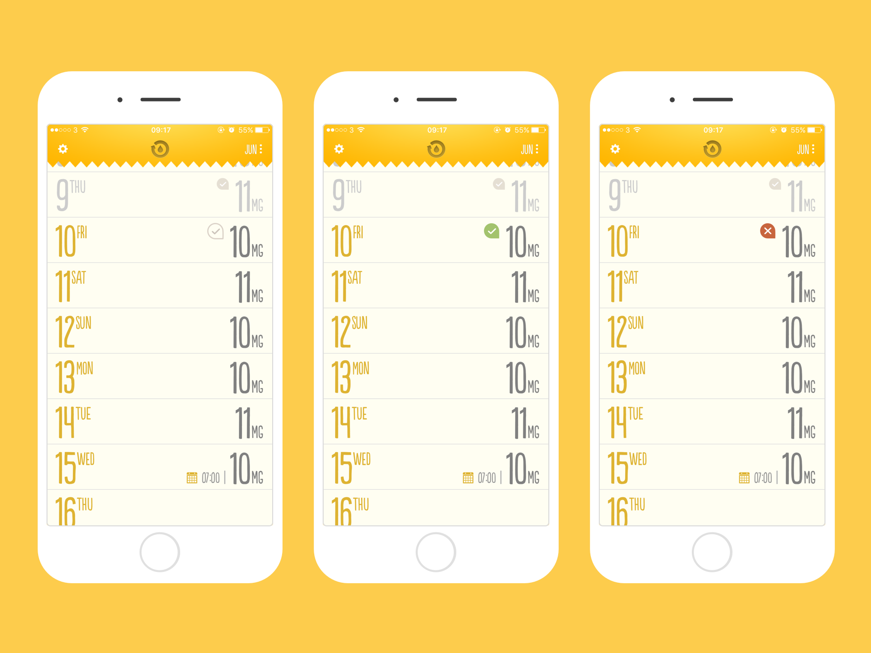
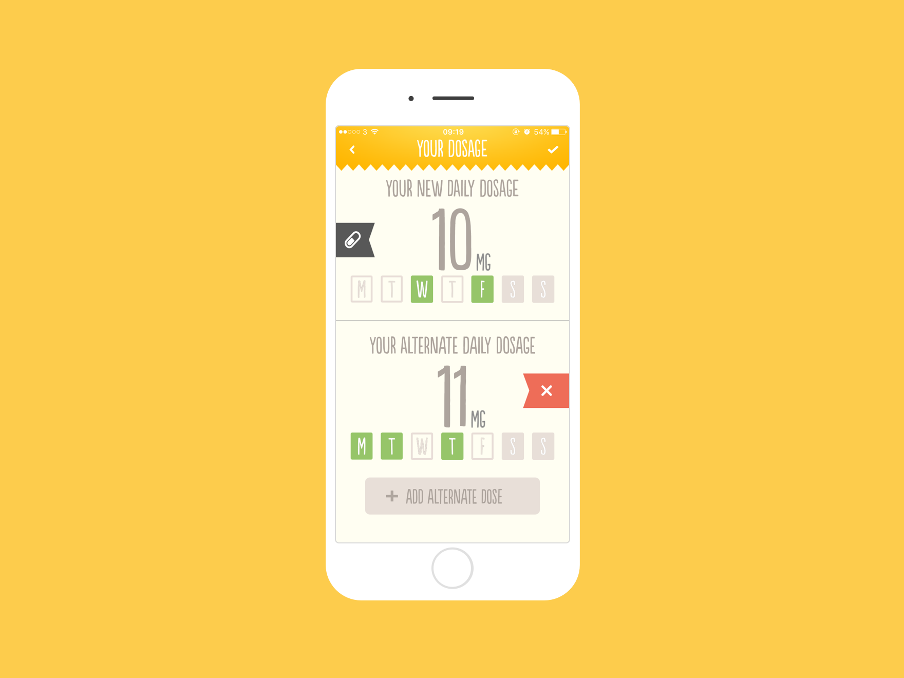
"I really adore the design of this app and it’s so easy to use. The person who made it clearly understands how the testing and dosage process work, which makes imputing information simple and intuitive. Thank you very much for making such a wonderfully designed and thought out app!"
Recognised by charity groups
After launching the app it’s been greatly received by patients and medical professionals as well as being recognised and supported by charities Anticoagulation Europe and Atrial Fibrillation Association.


Awards &
Mentions
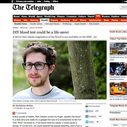
| DIY blood test could be a life-saver | The Telegraph | |
|---|---|---|
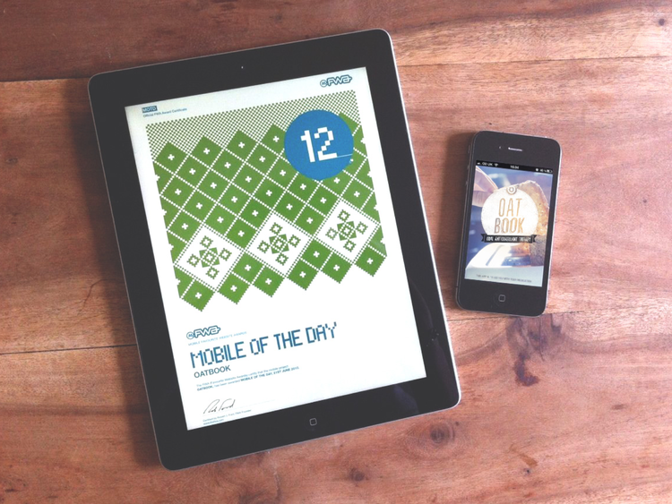
| App of the Day | FWA | |
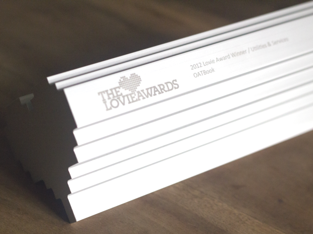
| Utilities and services | Lovie Award 2012 | |
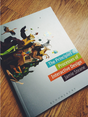
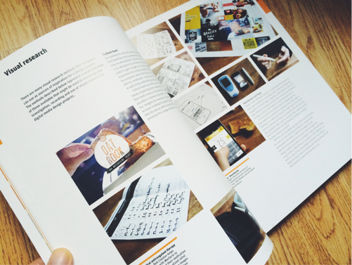
| The Principles and Processes of Interaction Design | Jamie Steane | |
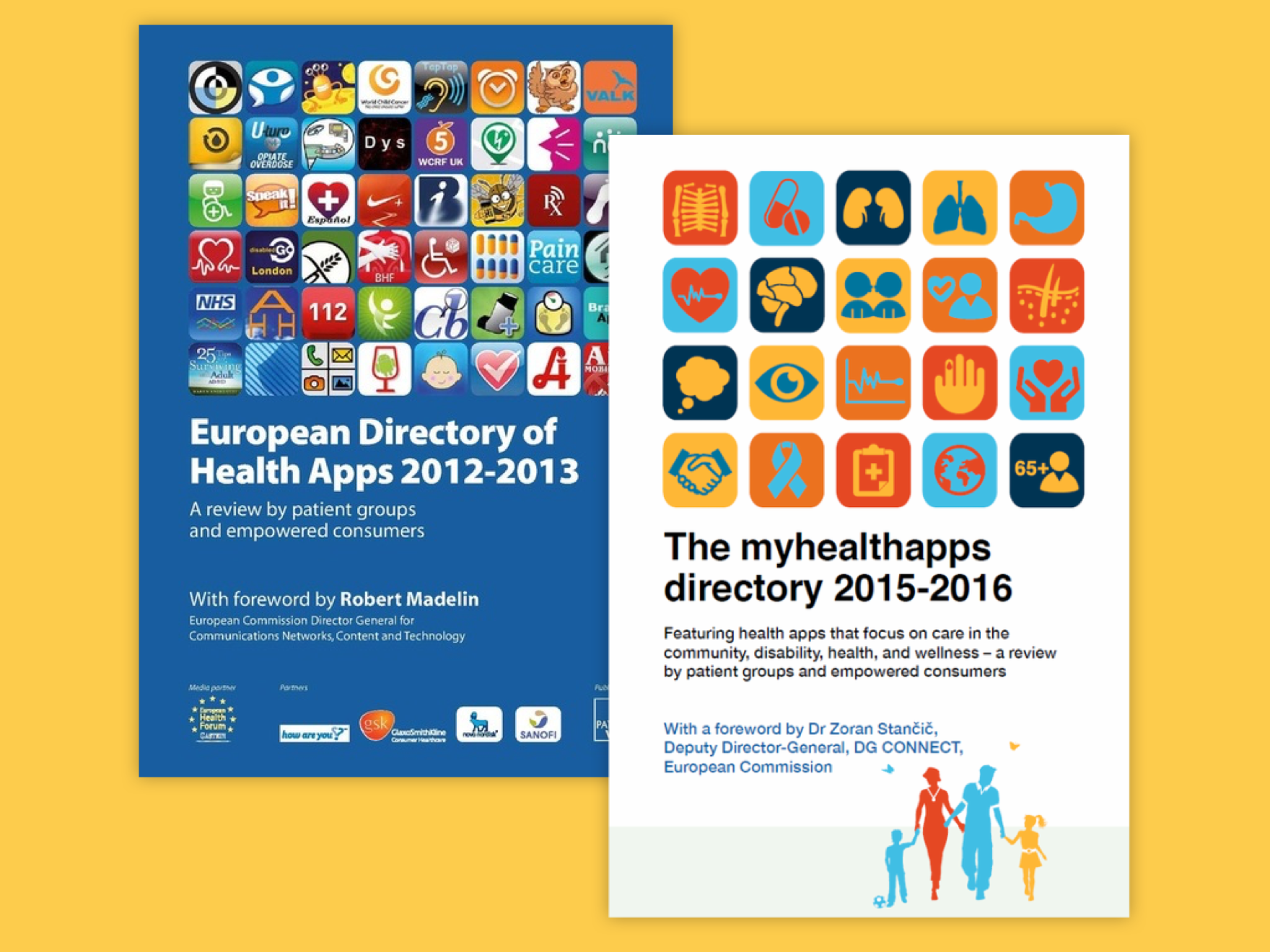
| European directory of Health Apps 2015-2016 | PatientView | |
| European directory of Health Apps 2012-2013 | PatientView | |

